
The Slave Route
Visualizing Slavery
- Map Courtesy of Geography and Map Division, Library of Congress
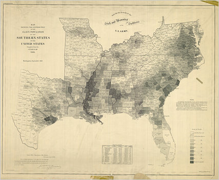
- Slave Population of the Southern States of the United States
The 1860 Census was the last time the federal government took a count of the South’s vast slave population. Several months later, the United States Coast Survey—arguably the most important scientific agency in the nation at the time—issued two maps of slavery that drew on the Census data, the first of Virginia and the second of Southern states as a whole. Though many Americans knew that dependence on slave labor varied throughout the South, these maps uniquely captured the complexity of the institution and struck a chord with a public hungry for information about the rebellion.
- Author(s):Suzan Schulten
- Source:The New York Times
- 10-12-2010